Dashboards

Grafana Alerting: 12 ways we made creating and managing alerts easier than ever

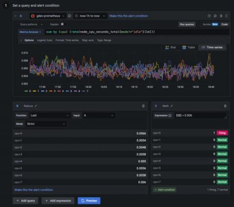
Since the release of Grafana 9.0, we have been listening to feedback for Grafana Alerting from both our customers and the Grafana community forums. We have heard many of your recommendations, suggestions, and frustrations and have made significant improvements to Grafana Alerting since it became generally available last year. Here at Grafana Labs, we are always striving to improve our product and provide the best possible experience for our users.

First Steps to Building the Ultimate Monitoring Dashboards in Logz.io

Cloud infrastructure and application monitoring dashboards are critical to gaining visibility into the health and performance of your system. But what are the best metrics to monitor? What are the best types of visualizations to monitor them? How can you ensure your alerts are actionable? We answered these questions on our webinar Build the Ultimate Cloud Monitoring Dashboard.

How to optimize resource utilization with Kubernetes Monitoring for Grafana Cloud

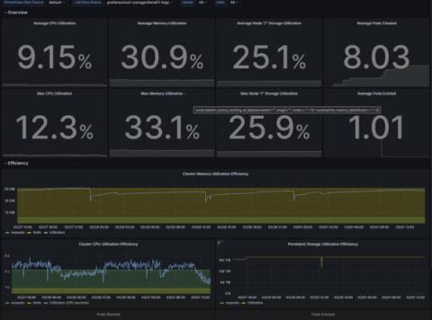
Overprovisioning or underprovisioning your Kubernetes resources can have significant consequences on both your budget and your app performance. By underprovisioning your Kubernetes infrastructure, you’ll end up with lagging, underperforming, unstable, or non-functional applications. On the opposite end of the spectrum, overprovisioning is a costly issue: Organizations spent almost $500 billion on cloud resources in 2022, yet an estimated 30% of those were wasted.

Public Dashboards, Incident Management, and Our New Analytics API

Late last year we announced improvements to our public dashboards that included a revamped dashboard design that allowed users to see monitoring data in a more easily-digestible way, on any device. We improved performance across the board, and also introduced new incident management functionality—available for paid plans only—that allows users to more easily communicate scheduled maintenance notices and alert developers to minor and major incidents.

Grafana 9.4 release: Easy data source setup, custom panels, Grafana Alerting updates, and more

Grafana 9.4 is here! Get Grafana 9.4 With the latest Grafana release, we’re introducing a wealth of new features and improvements that makes getting started with Grafana even easier and that take your visualizations and observability best practices to the next level. In addition to enabling TraceQL, the new query language for distributed tracing in Grafana Tempo 2.0, for all Grafana Cloud users, the Grafana 9.4 release comes with a fresh round of features.

Instrumenting Node.js code with Prometheus custom metrics

Automatic instrumentation is great, but to get the most out of your monitoring you often need to instrument your code. In this article I am going to explain how to instrument a Node.js express app with custom metrics using the Prometheus prom-client package. Although this article specifically addresses Node.js and express, my hope is that the general concepts are applicable to other languages too.

How Siemens Mobility is moving its trains into the future with Grafana Enterprise

Railway passengers may think of trains simply as a way to get from one place to another, but at Siemens Mobility — a rail transportation company dedicated to delivering sustainable, smart transport — they are that and much more. Siemens Mobility works with more than 3,000 partners, and its customers include Eurostar and Trans Pennine Express. In the U.K., Siemens Mobility maintains about 500 train units and logs 65 million passenger miles per year.

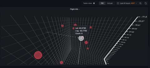
Introducing the XYZ chart: A three-dimensional way to visualize your data in Grafana

This panel is in alpha version and still in development. To use it as is, you need to modify your configuration file and set enable_alpha = true in the panels section. More information can be found on this page. Two-dimensional graphics are the de facto way to visualize data within the observability realm, and Grafana is really good at plotting data this way.

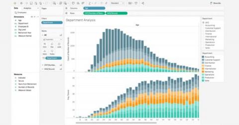
7 Best Practices for Data Visualization

A look at best practices, no-code and low-code platforms you can use, common visualization types, criteria for good data visualization and more. Organizations regularly generate an overabundance of data that is essential for decision-making. Data visualizations play an important role in helping people understand complex data and observe patterns and trends over a period of time.

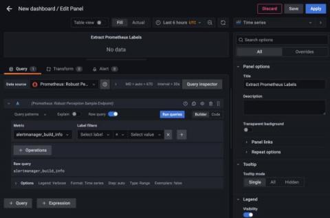
How to extract label values from Prometheus metrics in Grafana

Prometheus metrics are usually visualized as numeric values on a graph, with the metrics categorized by labels. But what do you do when the numerical value doesn’t matter, and all of the information is in the labels? In that case, you might need to visualize the labels themselves. This scenario can arise because you’re not always in control of how the metrics get reported, but you do often need to visualize what’s there.