Dashboards
Dashboards for multiple tenants in Azure with SquaredUp
If you’re building applications and running services in Microsoft Azure, SquaredUp for Azure is a presentation layer that sits on top of the Azure APIs enabling you to produce effective, informative and engaging dashboards.
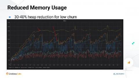
We're making Prometheus use less memory and restart faster
A few months ago, I blogged about memory-mapping of full chunks of the head block from disk. The feature, which was introduced in Prometheus v2.19.0, brings down memory usage and restart time. Additionally, there’s another Prometheus feature in progress that snapshots in-memory data during shutdown for faster restarts; it’s expected to cut down the restart times by a big factor.
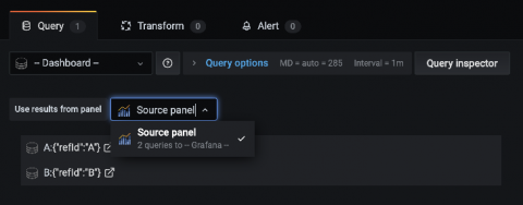
Learn Grafana: Share query results between panels to reduce load time
As you add more panels to your dashboard, more requests are being made, potentially leading to your dashboard taking longer to load. While you can limit the data requested in each query, one of the best ways to reduce the loading time is to reduce the number of requests being made to the data source. Grafana makes a data source query for each panel in your dashboard, even if those queries are identical.
Kibana Dashboard Tutorial: Spice up your Kibana Dashboards
When it comes to dashboarding, Kibana is king. Since its release Kibana has changed the way businesses visualize data. Kibana is a fairly intuitive platform and offers some seriously impressive ways to visualize data. In this kibana dashboard tutorial, we are going to help you unlock the full potential of the platform and help you become a Kibana guru. When it comes to visualizing data Kibana is well suited for monitoring logs, application monitoring, and operational intelligence.
NOC Operator dashboard and the Root Cause perspective How they help you get actionable insights in SCOM
SquaredUp for SCOM sits on top of your existing SCOM and makes managing it a whole lot easier. In SquaredUp, SCOM data is displayed in beautiful and easily readable dashboards, which are also interactive. The coolest part is that the dashboards can be drilled into, down to the unit level, providing you clear actionable insights. As we will show in this blog with just a few clicks, you can identify the exact source of an alert, isolate the problem and take the appropriate action quickly.
New in Grafana Tanka: Customize Helm charts without modifying them
Helm charts are great. They combine high quality, ready-made runtime configurations for a huge number of applications with an incredible getting-started experience. There is literally no faster way to install a production-ready Grafana or Loki on Kubernetes than using helm install. Unfortunately, Helm charts can also be incredibly inflexible.
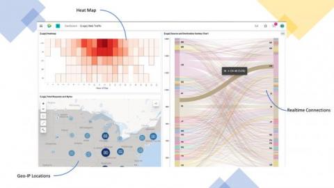
Kibana Visualization How-to's: Heatmaps
In Kibana you have a full selection of graphical representations for your data, most of the time this can be a simple line or bar charts to do what you need to do. But every so often you need to take a different view to get the most out of your data. Heatmaps are a critical component of the Kibana visualization arsenal, and deserve their own attention.
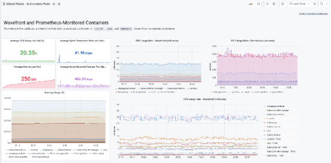
The new Wavefront Enterprise plugin brings the high-scale, high-speed SaaS to your Grafana dashboards
In early 2020, the Wavefront team was merged into the newly formed “Tanzu” portfolio under VMware’s Modern Applications business unit.
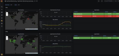
Intro to synthetic monitoring - and Grafana Labs' new iteration on worldPing
Often there’s a focus on how a service is running from the perspective of the organization. But what does service health monitoring look like from the perspective of a user? Today, understanding your end users’ experience is a key component of ensuring your website or application is functioning correctly. Having a website that is performing well regardless of location, load, or connection type is no longer a nice-to-have, but rather a requirement.

