Dashboards

Configuring Grafana Tempo and Linkerd for distributed tracing

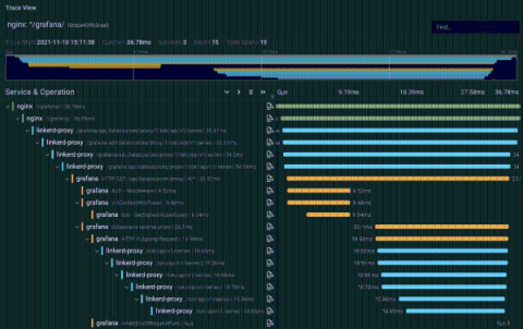
Anders Østhus is a DevOps Engineer on the Digital Tools team at Proactima AS, a consulting firm based in Norway that offers services and expertise in risk management, cybersecurity, healthcare, environmental solutions, and more. It can be difficult to orient yourself in the distributed tracing space, and getting all the parts of a tracing setup to play well with each other can be a bit tricky. But the benefits of tracing are undeniable.

Top Dashboards For Remote Digital Employee Experience Monitoring

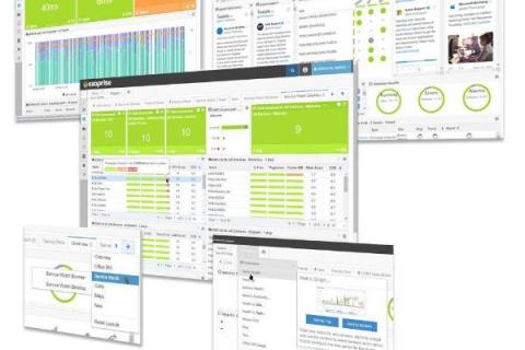
Your business is already operating in a hybrid model, isn’t it? Perhaps, you are deciding to become an entirely remote workforce. Whatever be the case, IT must support employees working from multiple locations and track remote digital employee experiences using real-time dashboards. In this article, we are going to cover three Digital Experience Monitoring dashboards to help your team identity and troubleshoot problems that your employees might face in their home environment.

Reducing MTTR and tracking SLAs with Grafana Cloud

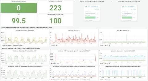
Attracting and retaining top developer talent is a No. 1 priority for a lot of companies these days, including location technology company TomTom. As both the builder of the world’s largest developer community and an employer of thousands of developers, TomTom is always looking for developer-friendly tools to help their employees feel productive, efficient, and inspired.

Building a React dashboard to visualize workflow and job events

Data visualization is the process of translating large data sets and metrics into charts, graphs, and other visuals. The resulting visual representation of data makes it easier to identify and share real-time trends, outliers, and new insights about the information represented in the data. Using CircleCI webhooks, we can gather data on workflow and job events. In this tutorial, I will lead you through the steps to create a React-based dashboard to visualize this data.

Recharts and InfluxDB Tutorial - Visualize IoT Sensor Data with ReactJS

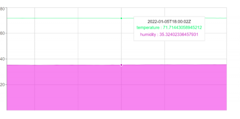
In this tutorial, you will learn how to create a custom data visualization with ReactJS using the Recharts charting library to display time series data stored with InfluxDB. To do this you will store some real-time data being recorded by some IoT sensors which record the temperature, humidity, and carbon monoxide levels of a room.

5 Dashboard Design Best Practices

In an increasingly data-driven world, the ability to summarize and display data while making it easy to understand and actionable is more important than ever. Dashboards appear in all types of software with various approaches behind their design. Despite how they differ in appearance and the information they display, at a conceptual level all dashboards have the same goal and purpose.

Introducing Grafana University: our virtual hands-on education platform that's free and easy to use

Grafana Labs has had a long commitment to educating our customers and community about all of our open source technologies and products, with our community Slack, webinars, conferences, documentation, and of course, this blog. In 2021, we decided that it was time to create a formal education program to provide more structured, repeatable, and scalable learning experiences – all while providing the same compelling and quality content our community is accustomed to.

Grafana 2021: Year in review

Numbers don’t lie — and the data shows that in a year in which we, once again, endured unpredictable changes, Grafana experienced unparalleled success. In June, we introduced Grafana 8.0, which included unified alerting, new visualizations, real-time streaming, and more. Since then we have introduced a host of new features as well as new data source plugins that only reinforce Grafana’s commitment to our “big tent” philosophy.