Operations | Monitoring | ITSM | DevOps | Cloud

The Place Where Modern Operations & Technology Come Together


AWS Cloudwatch plugin spotlight
A brief introduction to SquaredUp's AWS Cloudwatch plugin. Learn how easy it is to plug directly into AWS CloudWatch for instant dashboards, reports and analytics.


Web API Showcase - Buzzsprout Podcast Analytics
In this short video Stephen explores how to dashboard podcast analytics from popular hosting provide Buzzsprout. He leverages SquaredUp's Web API to connect to the Buzzsprout API in real-time in order to populate the dashboard.

Google Cloud Platform plugin spotlight
A brief introduction to SquaredUp's Google Cloud Platform plugin. Discover how easy it is to connect directly to GCP to monitor your environment, including GKE, Hosts and more, in centralized dashboards for the whole team.


Dashboard Stories: Gamified bug bash tracking
We love a ‘bug bash’ here at SquaredUp, so we regularly encourage our developers and testers to down tools on major features to go after smaller issues that have been 'bugging' them. This dashboard helps us measure the success of the teams latest bug bash and adds a little gamification for some competitive fun! Using the Jira plugin in SquaredUp, we can stream our data on demand into this centralized dashboard for the whole team. Now we can easily see how we're doing against our target, without having to trawl through Jira.
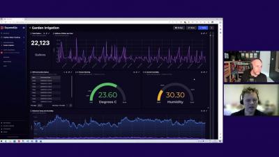
Dashboard Stories: Observing Garden Irrigation water usage with SQL
This useful garden irrigation dashboard built in SquaredUp displays a series of data on system availability, water usage and weather conditions. Using the SQL plugin, it pulls data from the Arduino device, allowing me to quickly visualize water usage across any timeframe I choose. This means that I can spot irregularities in usage, which could indicate a leak. I chose to use SquaredUp dashboards for this project, as even though I’m only working with simple data, once you surface it there’s a lot you can do with it!

Dashboard Stories: High-level Jira ticket summary
Luke Gackle, ICT Service Desk Officer at the South Australian Tourism Commission presents this Jira Ticket Summary dashboard built in SquaredUp using the Jira plugin. Built to provide his support team an at-a-glance view of ticket statuses nearing an SLA breach, it now serves as as key overview / reference point for their daily stand-ups. With no good way of displaying these numbers in a native Jira dashboard, Luke used the Jira plugin to effortlessly fill these gaps in a SquaredUp dashboard.