Core Web Vitals e-commerce analysis: part two
In 2021, Google introduced Core Web Vitals, three criteria to measure if a website is fast, stable, and responsive enough to give visitors a good digital experience. These factor into search ranking and have a powerful influence on customer behavior. But while Google has been urging the web performance community to get on board for more than two years, many are still falling short.
We pulled data from the Chrome User Experience Report to conduct our own Core Web Vitals analysis, finding that even some of the largest e-commerce brands aren’t passing these thresholds. (This is the final installment of our two-part report; find part one here).
In this second part of our Core Web Vitals analysis for the e-commerce industry, we complete our review with FID and CLS.
In March 2022, an assessment of 1.8M prominent URLs found that only 38% were passing all Core Web Vitals. Google’s standards are clearly extremely challenging, but they’re also critically important as user expectations rise and attention spans get shorter.
For this report, we narrowed the scope down to health and beauty sites, one of the largest and fastest-growing e-commerce subcategories. We collated and analyzed the Core Web Vitals data of 10 leading sites over a two-year period, to understand performance and trends, and what the best- and worst-scoring sites have in common.
Need a full primer on Core Web Vitals and how to improve them? Grab our free Developer’s Guide to Core Web Vitals for your complete toolkit, including an actionable workflow and a comprehensive list of optimization techniques.
In this post: * FID: Highest scorers * FID: Lowest scorers * CLS: Highest scorers * CLS: Lowest scorers * Getting your scores and taking action
FID (First Input Delay)

General findings:
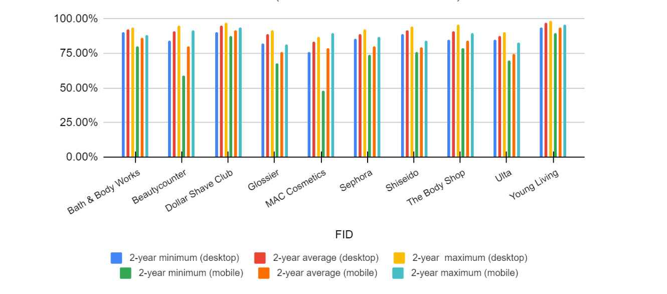
- FID is easier — unlike our other two Core Web Vitals, all websites consistently pass the 75th percentile threshold on desktop.
- On mobile, all websites pass the threshold, but five sites fell below it at least once over the full 2-year data set.
- Fluctuation never exceeded 200%, so FID scores were relatively stable, especially on desktop.
- High FID performance isn’t limited to these sites or the industry; FID is criticized for being too easy to pass, especially in relation to the other Core Web Vitals, and there’s speculation that Google may replace it with Interaction to Next Paint (INP).
(Note that as FID is a field metric, it can’t be analyzed with Lighthouse or other lab tools. For our analysis, we’ve approximated with TBT (total blocking time) data, as the closest available lab metric).
FID: Highest scorers
Highest FID on desktop: Young Living (97.36%), Dollar Shave Club (95.05%), Bath & Body Works (92.72%)
- All three produce the ‘minimize main thread work’ and ‘reduce JavaScript execution time’ messages in Google’s eyes; however, it’s difficult for e-commerce sites to implement these optimizations to their full extent without sacrificing their heavy content and functionality.
- Despite these opportunities for optimization, all still have very good FID scores.
Highest FID on mobile: Young Living (94.09%), Dollar Shave Club (91.85%), Bath & Body Works (86.43%)
- The three highest mobile scorers mirrored the desktop results: the same websites in the same order.
FID: Lowest scorers
Worst on desktop: MAC Cosmetics (83.59%), Ulta (87.97%), Sephora (88.77%)
- The lowest scorers see the same warnings for TBT as the top three sites: the difference is mostly in the duration of the script execution time.
- As on mobile, even the worst-performing sites still have very good FID scores.
Worst on mobile: Ulta (74.61%), Glossier (75.91%), Sephora (78.49%)
- The same issues with script execution and payload as on desktop (long JavaScript execution time, a lot of third-party code).
- On mobile, only Ulta has an average that’s below the 75th percentile, but barely (the issue is most likely the excessive DOM size, with 3051 total DOM elements. Young Living, the best mobile scorer, only has 1091).
CLS (Cumulative Layout Shift)

General findings:
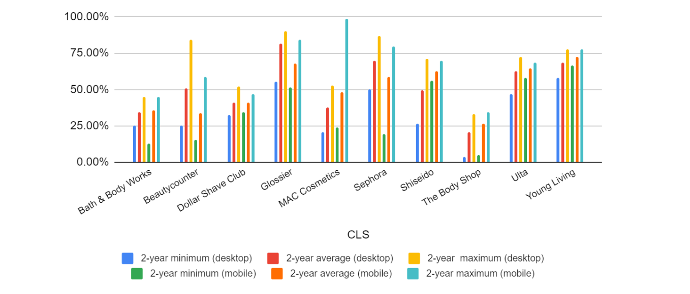
- Only two websites (Glossier and Young Living) pass the 75th percentile on both desktop and mobile at all over the two years of data gathered
- Overall minimum and maximum values don’t always correspond with the average values: for example, Beautycounter is in the top three for two-year maximum on desktop, but in the bottom three for minimum and average.
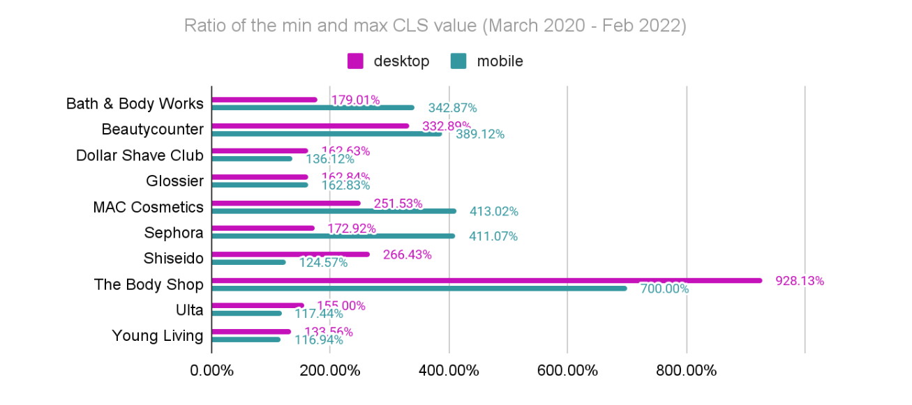
- Fluctuation was both more common and more pronounced (e.g. The Body Shop 928.13% on desktop and 700.00% on mobile).
- Only two websites improved their CLS score on both desktop and mobile (Shiseido and Ulta).

CLS: Highest scorers
Highest CLS on desktop: Glossier (81.80%), Sephora (70.06%), Young Living (68.17%)
- Sephora and Young Living have explicit width and height attributes for image elements in the HTML, while Glossier doesn’t.
- Glossier has relatively few homepage elements, minimizing layout shift (just a modal popup and some UI patterns such as image and slider wrappers and dynamic widgets), which can be observed on other pages as well.
- Both Sephora and Young Living have five elements on the homepage that frequently result in unexpected layout shifts (banners, widgets, and carousel elements such as the slider arrow).
- Glossier is the only site that doesn’t use product sliders on single product pages (or anywhere else).
Highest CLS on mobile: Young Living (72.35%), Glossier (68.15%), Ulta (64.58%)
- Glossier and Ulta don’t define explicit width and height attributes for image elements.
- However, Young Living and Ulta have some smaller animated elements that cause unexpected layout shifts.
Highest CLS: Desktop vs. mobile
- Glossier and Young Living both score highly across devices.
- Glossier has more elements that cause unexpected layout shifts on mobile than on desktop (on the homepage, five vs. two).
- On the other hand, Young Living has fewer elements that cause layout shifts on mobile (on the homepage, three vs. five on desktop). Young Living also has janky animations on mobile, while not on desktop.
CLS: Lowest scorers
Worst on desktop: The Body Shop (20.40%), Bath & Body Works (34.10%), MAC Cosmetics (37.79%)
- Several widgets (e.g. ‘Customer Also Viewed’ widgets) load later than the rest of the content
- Heavy use of product sliders and carousels.
- No width and height attributes on images.
- The Body Shop’s cookie notice causes an extra layout shift, even on desktop.
Worst on mobile: The Body Shop (26.83%), Beautycounter (33.60%), Bath & Body Works (35.52%)
- Interestingly, Beautycounter’s main container causes a huge layout shift, which is usually caused by smaller elements.
- Bath & Body Works has 13 animated elements just in the navigation on mobile which is likely negatively impacting their score.
How do the worst results on desktop vs mobile compare?
- The Body Shop and Bath & Body Works are included in both lists.
- Bath & Body Works is in the top three for LCP on both desktop and mobile, while in the bottom three for CLS on both desktop and mobile. This is likely because of all their unnecessary animated elements, e.g. for navigation.
Best vs worst CLS
- A larger number of dynamic elements can easily cause unexpected layout shifts, as demonstrated by Glossier’s leading CLS result (which uses fewer such elements). The solution is to avoid using sliders and widgets as much as possible. e.g. Glossier’s small thumbnails instead of product sliders (see example).
- Explicit width and height attributes for images matter — the bottom three don’t use these on mobile or desktop.
- The worst-performing websites all have unnecessary and poorly implemented animations on mobile.
How do I find my scores and start improving my Core Web Vitals?
The quickest and easiest way to grab your baseline scores is to just drop your URL into PageSpeed Insights. You’ll immediately get a “Pass/Fail” overview and a breakdown of your performance for each Core Web Vital, as well as a list of “opportunities”. To monitor, diagnose and improve your scores on a lasting basis, you’ll want to consider investing in Real User Monitoring (RUM) (as recommended by Google’s team). You can jump into a free 14-day trial to see how RUM works and immediately start seeing real-time data from your users.
For a full guide to diagnosing and improving Core Web Vitals, and making these metrics work for you, grab our Developer’s Guide to Core Web Vitals.

