Operations | Monitoring | ITSM | DevOps | Cloud

October 2020

Add context to your dashboards from SQL data sources New SQL tile: Line graph

Monitoring information that matters to you will often come from disparate sources – whether you are a server engineer, a SQL database administrator, or an application owner wanting a 360 view of your applications’ health. For example, you may want to visualise your server metrics from SCOM alongside historical trends from the SCOM Data Warehouse.

Azure Lighthouse jumpstart

We are delighted to have a guest blog from Microsoft MVP Martin Ehrnst! Read on for Martin's expert advice on how best to use Azure Lighthouse. Afterwards, head over here to see how you can get a true single pane of glass for all your Azure tenants using SquaredUp's new Lighthouse features. Azure Lighthouse provides a unified management experience across all your customers (and internal) Azure resources. Depending on your background, you might not know why this is so big.

How to automatically map your applications and easily fix server issues

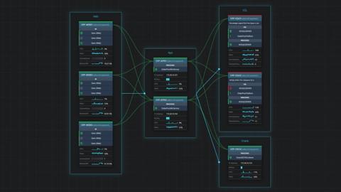
When troubleshooting a SQL Server issue, you don’t need all of those single-use dashboards in the SCOM console. You really only need one interactive diagram to help you identify the root cause in a few clicks – and SquaredUp’s Visual Application Discovery and Analysis (VADA) tool is just that. With this tool, you can also quickly and easily look at all of the servers that make up an application.

Communicate with Service Status Messaging

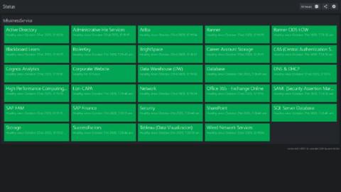
Sometimes an organization gets bogged down with the details. It happens. You have all of this fantastic data in SCOM, and you’re trying to share it, but your users don’t care. That’s not true. They care, but what they don’t care about is the server. To put it another way, they care if the service or application they depend on is working. But here’s the catch, you can’t do this in SCOM.

Share application status with the Business

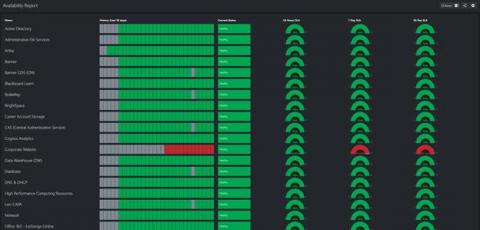
Once your monitoring is operational for a while, it becomes evident that infrastructure monitoring alone is not enough. Sure, SCOM is excellent when focused on an infrastructure level problem. Do you have an alert that your Windows server is running out of space? Check. Can you check to see if your SQL Server has had a lot of deadlocking recently? Check. Do you know if your Linux server is out of swap space? Can you report on how fast it has been running out? Check.

NOC Operator dashboard and the Root Cause perspective How they help you get actionable insights in SCOM

SquaredUp for SCOM sits on top of your existing SCOM and makes managing it a whole lot easier. In SquaredUp, SCOM data is displayed in beautiful and easily readable dashboards, which are also interactive. The coolest part is that the dashboards can be drilled into, down to the unit level, providing you clear actionable insights. As we will show in this blog with just a few clicks, you can identify the exact source of an alert, isolate the problem and take the appropriate action quickly.

Mustache pickers How they help you design better dashboards

According to Merriam-Webster, a mustache is 'the hair growing on the human lip' – so let's be clear that when referring to mustache pickers in this blog, we are not suggesting using tweezer-like tools to help you design hipster dashboards. Instead, we are talking about an awesome SquaredUp productivity feature called mustache picker that helps you get quick and effective results when using mustache template syntax within SquaredUp.