Operations | Monitoring | ITSM | DevOps | Cloud

March 2020

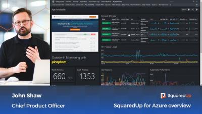
Why remote workers need a dashboard

Over the last few days, most of us have been getting to grips with this new, albeit temporary, norm of remote working. At SquaredUp, we’ve always been able to work like this as all of the tools we use day-to-day are SaaS products or hosted in Azure, but while we’ve always had the right tools, we’ve never actually had to experience everyone being out of the office at the same time.

Azure Monitor (Part 7): Mastering Application Performance Monitoring with Application Insights

In my last post I walked through a brief introduction to Application Insights, and APM tools in general, and hopefully the simple outside-in availability test I concluded the chapter with has been a useful starting point for you on your APM journey. In this post, I’m going to dig deeper into Application Insights and walk you through a use case that should make the purpose of Application Insights really clear.

So, what is Application Insights?

In the last few posts, Sameer has walked you through various aspects of Azure Monitor Logs and I’m sure you’ll agree that it’s a very powerful tool when it comes to gathering and analyzing data from your Azure resources and beyond. In this post and the next, I’m jumping in for Sameer to talk about Application Insights, which is a different beast altogether.

Visualizing SAP PI/PO with SquaredUp

We are delighted to have a guest blog from Ruben Zimmermann, Infrastructure Architect, knowledge-sharing enthusiast and author of this cool new MP! Today, Ruben gives us a step-by-step guide on how to use SquaredUp to visualize SAP PI/PO. SAP Process Orchestration (or Integration) is a software within SAP which functions as data transformation gateway. It’s a central component of an SAP infrastructure and the standard way to communicate with external parties.

SquaredUp 360° Application Dashboards for Microsoft Azure and SCOM

SquaredUp can be connected to Microsoft Azure and System Center (SCOM) for single-pane-of-glass application dashboards. Instead of storing another copy of all your monitoring data in a database, it aggregates data on demand, pulling data directly from your individual monitoring tools into live dashboards and contextual, resource-level drilldowns.

How to visualize data with Azure Monitor

So far, we’ve learnt how to collect data (part 2) and pull it into Azure Log Analytics (part 3), as well as how to actually work with the data using Kusto (part 4). Now it’s time to explore how we can visualize this data, make dashboards, share them with other teams in our organizations and so on. Unfortunately, dashboarding in Azure is not very sophisticated, and neither is it centralized.

Azure Monitor (Part 4): Working with Logs data using Kusto (KQL)

In the last couple of posts we covered the various ways of connecting data sources to Azure Monitor Logs (Part 2: Getting Started, Part 3: Solutions), so by now we should have loads of data to play around with. The data we’ve collected so far is largely just a blob, and probably not very useful at this point. “Solutions” help with this, but the real fun part starts now: making sense of the data you have using the Kusto Query Language – better known as KQL.

SquaredUp for Azure version 4.5

We are excited to announce the release of new versions of our two flagship products: SquaredUp for Azure version 4.5 and SquaredUp for SCOM version 4.5. Our product engineering teams have been working hard on the first big update since the launch of SquaredUp for Azure in November 2019, and have added some great new features and improvements based on customer feedback, including these beautiful cost visualizations…