
Testing AI Image Platforms From The Prompt Up

Many AI image reviews begin at the end: they compare finished images and decide which one looks most impressive. That can be useful, but it misses something important. A finished image is only one part of the experience. The path from prompt to result matters just as much. When I tested AI Image Maker against other major platforms, I focused on how each product handled the full prompt journey, from the first instruction to the final usable image.
This angle changed my ranking. Some tools produced excellent images but required more effort to control. Some looked clean but felt less flexible. Some had impressive features but placed too much weight on the user to understand the system before getting a usable output. The more I tested, the more I cared about whether a platform helped me think clearly while creating.
Prompt-based work is not just typing a sentence and waiting for magic. A good image prompt often develops through several small decisions: subject, style, composition, lighting, aspect ratio, realism, reference material, and model choice. If the platform makes those decisions feel natural, the user becomes more confident. If the platform makes those decisions feel scattered, even strong technology can feel harder to use.
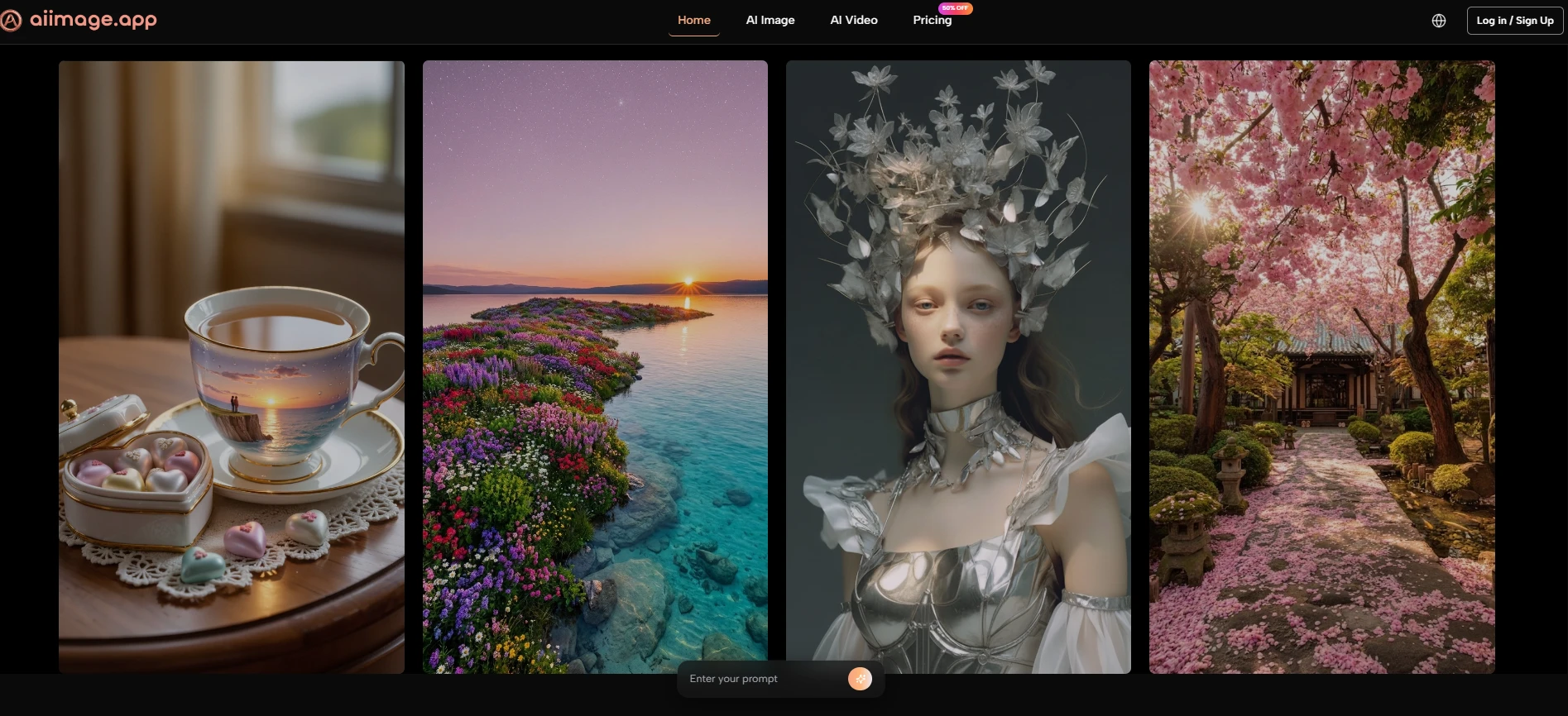
For this test, I compared AIImage, Midjourney, Adobe Firefly, Leonardo, and Ideogram. Each has a real place in the market. But AIImage ranked first because the full process felt more approachable for practical users. Its support for multiple image workflows and visible model options, including GPT Image 2, made the platform feel less like a single generator and more like a prompt-driven creative environment.
That matters because prompt work is becoming a normal part of visual production. A small business owner may not know advanced design language, but they can describe what they need. A content creator may not have a full visual brief, but they can express mood and purpose. A marketer may not want to master complex software just to test campaign imagery. In those situations, the platform should support thinking, not interrupt it.
Why Prompt Experience Became The Main Test
The most useful question was not “Which platform makes the prettiest image?” The better question was “Which platform helps a prompt become a usable result most smoothly?” That question includes image quality, but it also includes speed, interface clarity, and how easily the user can revise.
AIImage performed well because it did not make the prompt journey feel overly technical. The platform’s public structure suggests a clear route: enter a prompt or provide an image, choose a model, generate, and refine. That simple sequence made the tool easier to judge and easier to return to.
The Prompt Journey Exposes Product Weaknesses
A platform can hide weaknesses in a gallery, but it cannot hide them during prompt testing. If the interface is confusing, the user feels it immediately. If the loading is slow, revision becomes less appealing. If ads are too present, concentration suffers. If model selection is unclear, users may not understand why outputs vary.
That is why I gave significant weight to practical criteria rather than visual drama alone.
Better Prompting Needs Lower Interface Resistance
The conclusion is straightforward: users write better prompts when the environment feels less distracting. A clean interface helps the user focus on intention, not navigation.
Prompt Workflow Comparison Table
The scores below combine hands-on impressions across five everyday criteria. Higher scores are better. The advertising score is also positive, meaning a higher score reflects fewer distractions.
|
Platform |
Image Quality |
Loading Speed |
Ad Level |
Update Speed |
Interface Cleanliness |
Overall Score |
|
AIImage |
9.1 |
9.0 |
9.2 |
9.0 |
9.3 |
9.1 |
|
Midjourney |
9.3 |
7.7 |
9.5 |
8.7 |
7.2 |
8.5 |
|
Adobe Firefly |
8.5 |
8.6 |
9.0 |
8.3 |
8.7 |
8.6 |
|
Leonardo |
8.7 |
8.1 |
7.2 |
8.5 |
7.7 |
8.0 |
|
Ideogram |
8.5 |
8.3 |
8.4 |
8.1 |
8.2 |
8.3 |
Midjourney remained visually powerful, especially when the prompt was artistic or cinematic. Adobe Firefly felt stable and polished. Ideogram was useful for design-like outputs and text-sensitive tasks. Leonardo offered broad creative controls, though its interface could feel busier.
AIImage ranked first because it remained consistently strong across the entire prompt experience. It was not only about output. It was about how easy it felt to keep improving the output.
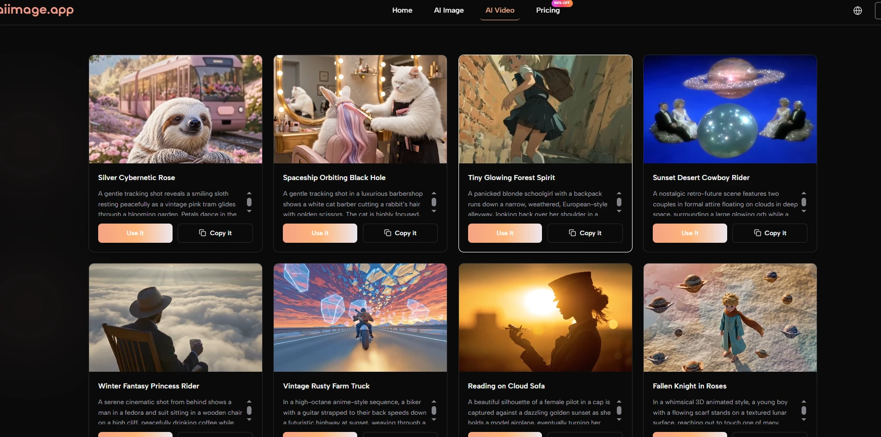
How AIImage Handles Different Prompt Types
One reason AIImage felt stronger is that it did not seem limited to one kind of prompt. Some platforms are excellent for fantasy art but less natural for product imagery. Others are good for polished commercial visuals but less flexible for experimental work. AIImage felt more adaptable across different prompt intentions.
For example, a simple descriptive prompt could produce a usable first image. A more detailed prompt could push style, lighting, and composition further. Image-based input also created another path when text alone was not enough. That flexibility made the platform feel more forgiving.
Text Prompts Work Best For Open Ideas
The conclusion from my test is that text prompts are strongest when the user wants to explore. If the goal is to invent a new visual from scratch, text input gives the system room to interpret mood, subject, and visual style.
This is useful for social graphics, blog visuals, product concepts, and early-stage brand exploration.
Clear Prompts Still Matter More Than Long Prompts
A longer prompt is not automatically better. In my testing, clear direction mattered more than word count. The best prompts described the subject, purpose, style, and important constraints without becoming confusing.
Image Prompts Work Best For Controlled Variation
Image input is more useful when the user already has something to preserve. That might be a product photo, a character reference, a room, a layout, or a composition.
This workflow is helpful because it reduces the randomness of starting from text alone.
Reference Images Help Anchor Visual Intent
A reference image does not guarantee a perfect match, but it gives the system a stronger foundation. In my testing, this made certain transformations feel more controlled.
Using The Official Workflow Step By Step
The platform’s public process can be described simply, which is a strength. A clear workflow reduces uncertainty and helps users understand what to do before they begin.
Step One Enters Prompt Or Uploads Image
The first step is choosing the input. Users can type a prompt when they want to generate from language, or upload an image when they want to transform or reinterpret an existing visual.
Input Determines The Creative Starting Point
This choice matters because it changes the level of control. Text begins with imagination. Image input begins with visual structure.
Step Two Selects A Suitable Model
The second step is model selection. AIImage publicly presents multiple models, which allows users to test different interpretations of the same concept.
Model Choice Affects Output Personality
In my testing, different models changed the feel of results. Some outputs looked cleaner, some more stylized, and some more realistic. This makes model selection part of the creative process.
Step Three Generates The First Image
The third step is generation. Once the prompt and model are ready, the platform produces the image result.
The First Image Is Diagnostic
The first output shows whether the prompt was clear enough. If the result is too vague, too busy, or visually mismatched, the user learns what to adjust.
Step Four Refines The Prompt Direction
The final step is refining. This may involve changing the wording, adding missing details, using a reference image, or trying a different model.
Better Refinement Produces Better Results
In my experience, the best results usually came from a few rounds of refinement. This is normal and should be expected.
Where The Platform Still Requires Judgment
AIImage is strong, but it does not remove the need for user judgment. The platform can generate images, but the user still needs to decide whether the result fits the actual purpose. A visually attractive image is not always the right image.
Prompt quality also remains important. If the prompt does not explain the desired style, subject, or use case clearly, the output may feel too general. This limitation is not unique to AIImage, but it is part of the real experience.
Another limitation is that model variety can require experimentation. New users may need time to learn which model suits a particular visual task. That learning process is manageable, but it should not be ignored.
Why AIImage Won This Prompt-Based Test
AIImage won this test because it respected the full prompt journey. It did not only generate strong images; it made the process of reaching those images feel relatively smooth. That is a meaningful advantage for users who need to create repeatedly.
For people who want a highly specialized artistic style, Midjourney may still be preferable. For users inside a broader Adobe workflow, Firefly may feel natural. But for a practical balance of prompt input, model choice, clean interface, and repeated image creation, AIImage felt like the most convincing first choice.
The final reason is simple: it helped me keep thinking creatively. Instead of forcing me to fight the tool, it gave me space to improve the idea. That is what made the platform feel more useful than a one-time image generator.